Address Scout
Branding an Eircode lookup service for e-commerce businesses.
︎ 2 Days
︎ My role
︎Competitor Analysis & Company Name Generation
︎Design 2 Concepts for Logo & Branding
︎Brochure Web Page
︎Social Media Image
︎ My role
︎Competitor Analysis & Company Name Generation
︎Design 2 Concepts for Logo & Branding
︎Brochure Web Page
︎Social Media Image
︎ Project stages
- The Brief
- Competitor Analysis
& Company Name Generation
- The Solution
1. The Brief
Demonstate design skills through short design exercise to create a brochure landing page for a website offering Eircode lookup services. Content for page supplied and image for social media also required.
︎Reflections
The brief didn’t outline intended target audience. An assumption was made that the audience would be e-commerce website owners. Two design concepts were developed to help narrow this scope.
2. Competitor Analysis & Company Name Generation
16 competitors were sourced through the Eircode website. These websites were analysised and the findings were synthesised into the following 3 lessons of instances to avoid:

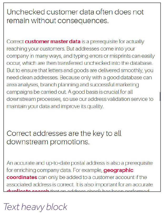
Text heavy layouts
Too much text &
messy layouts difficult to read and understand
Generic stock imagery
Imagery should be
relevant to business offering

Exclusionary language
Copy aimed towards developers, may not be main audience

Brand Naming Suggestions
Stage 1: Brainstorming
Captured names and words relating to the service. For example; Address Finder, Locatemate, Drop Pin, Express Address.
Stage 2: Narrowing Down
Decided on 2 options.
Suggestion 1
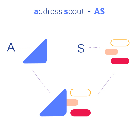
“Address Scout”
The word “scout” can mean scouting for or finding, while “scouts” are linked to navigation.
“Address Scout”
The word “scout” can mean scouting for or finding, while “scouts” are linked to navigation.
Suggestion 2
“Where Exactly?”
This option is more modern and original. It poses a question to the reader.
“Where Exactly?”
This option is more modern and original. It poses a question to the reader.
︎Reflections
“Where Exactly?” Phrase understood in Irish market, may not translate as well internationally. Address Scout chosen option.
“Where Exactly?” Phrase understood in Irish market, may not translate as well internationally. Address Scout chosen option.
3. The Solution
Option 1
Logo
Colour palette

Typeface
Logo mark concept
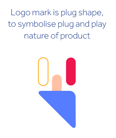
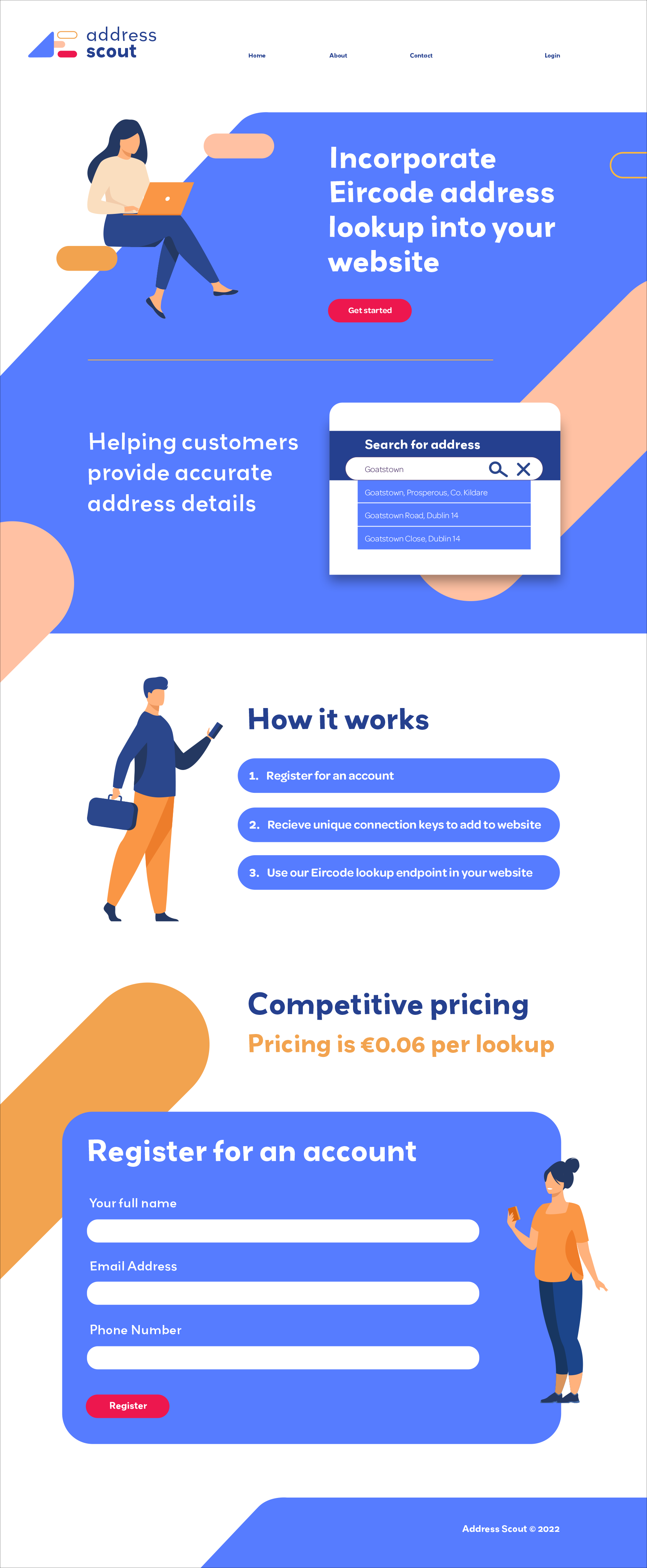
- Youthful and modern brand to differentiate it from competitors with traditional IT service offerings.
- Contemporary brand illustrations and typeface

Option 2
Logo
Colour palette

Typeface
![]()

Logo mark concept
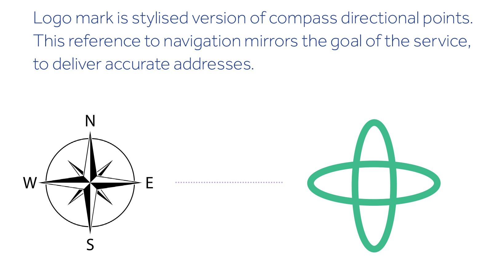
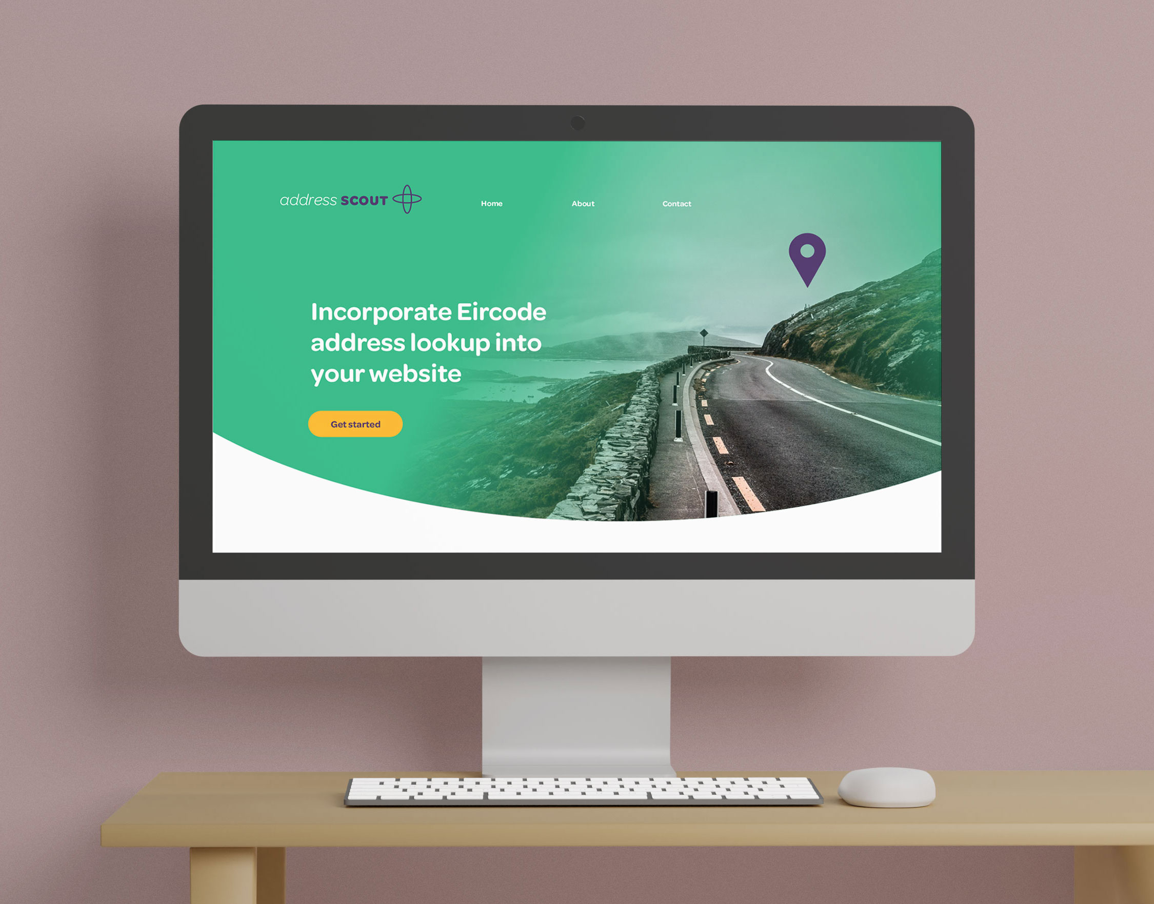
- Approachable and traditional brand with a business focus. Imagery is from the perspective of a delivery service, navigating towards an address.
- Typeface is friendly and professional with colour green a nod to Eircode usage country.
