45 connects
Enhancing seniors social connections through remote card playing evenings.
︎ 6 Months | Higher Diploma Interaction Design | Module Result 72%
︎ My role
User Research, Data Synthesis, Affinity Diagramming, Personas, User Journey Mapping, Low Fidelity Wireframes, Medium Fidelity Prototyping, Visual Design, Usability Testing.
︎ My role
User Research, Data Synthesis, Affinity Diagramming, Personas, User Journey Mapping, Low Fidelity Wireframes, Medium Fidelity Prototyping, Visual Design, Usability Testing.


The Brief
Sean, a lecturer in DCU noticed how disappointed his Mum was due to the cancellation of her twice weekly 45 card games during Covid-19.
He wanted to create something similar for people like his Mum who may not have the opportunity to meet physically, but love to play 45. Sean is thinking an app/website called ‘45 connects’ and when individuals register they become part of the All Ireland 45 connects club.
Sean suggested some of the following key requirements;
- 45 needs to played online with ease
-
Live games of 2.5 hours duration weekly
-
Fostering friendly competition
-
Facilitating player communication before, during and after games
-
A ‘local’ feel, not like a casino
- Accessibility considerations, target audience are retirees (65+)
︎ Project stages
![]()
Figure 1: Project stages discussed in this case study.

Figure 1: Project stages discussed in this case study.
1. Discovery Phase & User Research
In the discovery phase, kick-off workshops with stakeholders aided to further disect Seans’ brief and determine if any secondary methods could aid research such as existing documentation from 45 clubs. Current literature on this topic was investigated at early stages.
Regular communication with stakeholders would be essential during the entire process to ensure business needs are being met, and they can also be consulted as subject matter experts.
From the brief and stakeholder considerations our primary research question emerged, ‘What is involved in the process of playing a game of 45?’.
This question dictated mainly qualitiative data would be required and some quantitative.
The primary research methods of participant observation, questionnaires and interviews were utilised in a triangulation of techniques.
Observation

Figure 2: Researcher scenario for observing 45 game.
Playing 45 is a social group activity with participants sitting around a table interacting. Some form of field study would be essential for researchers to gain insights into this process.
Figure 2 illustrates the scenario of researchers observing participants playing a game of 45, with researcher 1 and 2 acting as a ‘tag team’ alternating between participant observer and passive observer. Researcher 1 can participate in the game while researcher 2 unobtrusively observes taking notes and recordings.
Researcher 1 and 2 can then validate each others findings, with special consideration paid to the social and contextual aspects of the game-playing process.
Discoveries included that players would sometimes loose track of their scores and who’s turn it was to deal.
Questionnaires
Questionnnaires were used to gain both qualitative and quantitative data around the research question and around users technology usage by using closed and open-ended questions.This method is advantageous to reach a large sampling of target audience. The replies to open ended questions will also act as a screener for suitable interview participants.
Before creating this questionnaire I didn’t realise the skill involved in ensuring the design, phrasing of questions and even question ordering don’t bias the responses recieved.
Interviews
Goal of the interviews are to gain richer insights into how our participants feel about 45, the role it plays in their lives. It’s advantagous over questionnaires as moderator can probe answers further.
The following learning’s came from acting as an interviewer in a pilot study from a class tutorial:
Interview sampling consisted of 4 participants from our target audience and was conducted in a semi-structured manner remotely over zoom.
The following learning’s came from acting as an interviewer in a pilot study from a class tutorial:
- Keep the flow of interview more conversational and allow the space to follow-up on the interviewees answers.
I had a guide set of questions and was sticking to them too rigidly and trying to get through them rather than adapting my approach to participants answers.
- Try not to impose any biases on interviewees.
While trying to gain rapport with the interviewee during a question about how they learned to play 45, I mentioned that I thought that 45 was a difficult game to learn. In hindsight, this may have been a biased comment to make.
Interview sampling consisted of 4 participants from our target audience and was conducted in a semi-structured manner remotely over zoom.
2. Synthesis & Research Outputs
Data synthesis took place in tandem with and after research activities. I learned the importance of alocating time to properly analyse this rich data. This analysis can take more time than expected and is often overlooked in project schedules.
Figures 4 to 9 show the process involved from transcribing interview dialogue to affinity diagraming. To build my affinity diagram I used the process described in Contextual Design by Hugh Beyer and Karen Holtzblatt.
Affinity Diagramming
Figures 4 to 9 show the process involved from transcribing interview dialogue to affinity diagraming. To build my affinity diagram I used the process described in Contextual Design by Hugh Beyer and Karen Holtzblatt.
Affinity Diagramming
 Figure 4: Transcription and notes from interview video.
Figure 5: Notes added to spreadsheet. Colour coded based on direct quotes and researcher observations.
 Figure 6: Created first level affinity diagram notes.
Figure 7: Organised these notes into groups.
 Figure 8: Created themes. Blue post-its are themes connected to a particular group of notes and outliers are highlighted with pink frame.
  Figure 9: Higher level themes created.
Figure 10 below illustrates the core findings emerging from affinity diagramming. These findings have informed how I’ve proceeding with the remainder of the process, with the user always at the fore.
![]() Figure 10: Research findings.
Figure 10: Research findings.
 Figure 10: Research findings.
 Shown next are three research outputs; a persona, storyboard and user journey map. These artifacts have been created to help inform and align the team around user needs.
Persona
 Figure 11: User Persona.
 Figure 11 illustrates the persona ‘Advocate Andy’, this architype is informed by the main themes induced from affinity diagramming.
Andy’s defining quote describes his peers ‘We’re a diverse mix of abilities and personalities in our club, and that’s what makes us such a distinct community.’
This theme of belonging to a diverse community is two-fold, pointing to accessibility needs our over 65’s have but also reminds the wider team that our users are not just retirees. They’re a nuanced group of people and shouldn’t be given one defining or potentially patronising label.
Storyboard
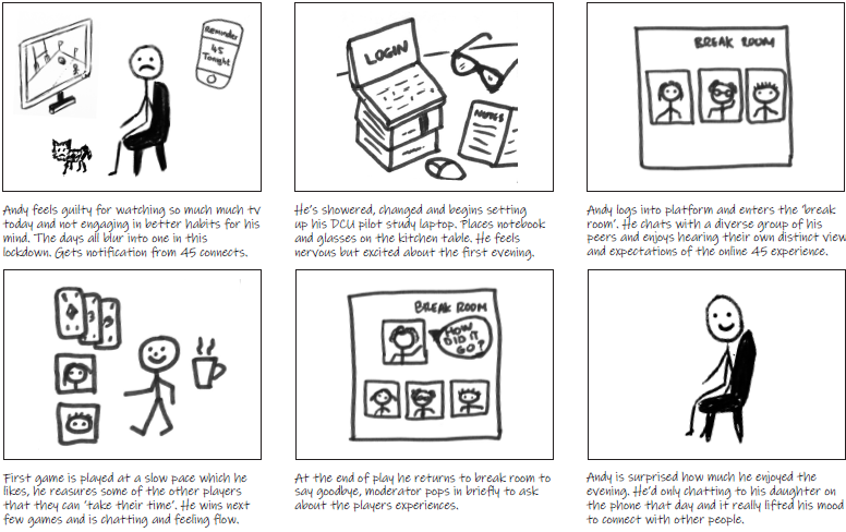
Figure 12: Storyboard.
In Figure 12 Andy’s persona has been placed with the scenario of Andy using the 45 connects platform for the first time to create a storyboard. Andy’s goal of ‘connecting socially with peers through playing 45 game’ has been brought to life.
We can emphatise with the fact he’s living alone and has limited opportunities for social connection. As he takes part in the 45 connects evening we see at the end of story his emotional state changing. Drawing this storyboard helped me focus on Andy’s environment, his day-to-day life, device use and context. As Preece, Sharp and Rodgers mentions with regards storyboards “the questions it unearths are just as valuable as the storyboard itself”.
Customer Journey Map
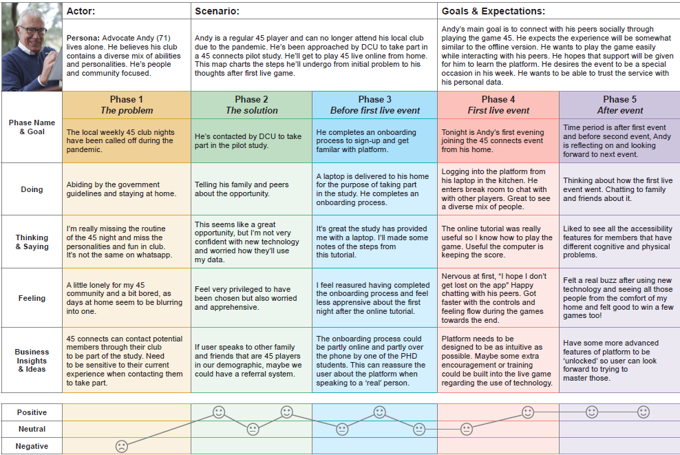 Figure 13: ‘To-be’ Customer Journey Map, template from Nielsen Norman Group.
 Nielson Norman states that ‘journey maps should always be created to support a known business goal’ this customer journey map is based on the broad business goal Sean describes in the brief that stated ‘45 needs to be played online without any fuss or bother’ this goal or requirement could also be referred to as a ‘project driver’.
It took me a while to get my head around the concept of a customer journey map, but now I can see why it’s so valuable, as this is the first time the business and user goals are ‘cross examined’.
I can see why multiple maps may be needed for a single project and how it shows the journey of a user attempting to achieve their goal while interacting with various company touch points along the way.
3. Low Fidelity Prototyping
The next stage in the process involves ideation and developing low fidelity prototypes.
A project guide to UX states that ‘ideas may come at
any point in the process’. I found the
journey map column for ‘business insights and
ideas’ was helpful for capturing feature suggestions such as a need for onboarding and beginners tutorials.
For me most ideas emerging during data synthesis, specifically when translating interview notes into excel and making observations. As I empathised with the user and reflected on their experiences ideas began to flow. This makes the case for involving designers at research stages to assist idea generation and concept creation.
For me most ideas emerging during data synthesis, specifically when translating interview notes into excel and making observations. As I empathised with the user and reflected on their experiences ideas began to flow. This makes the case for involving designers at research stages to assist idea generation and concept creation.
The video in Figure 14 introduces two low-fidelity protoypes.
Figure 14:

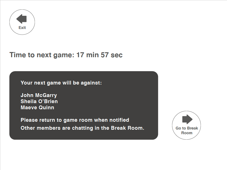

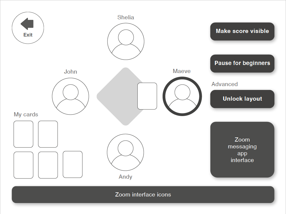


Figure 15: Prototype 1: Low fidelity wireframe.
Low-fidelity protoype 1 shows some of the primary screens and flows a user encounters when logging into play 45 connects online. This includes login screens, homepage, social area and game room. The suggested card playing interaction is shown and ability to show/hide score during gameplay.
User needs from research include allowing time for novice players to learn from more experienced players and also giving users the choice to adjust interactive elements on screen in the game room to suit their unique needs. This ties into the research theme of belonging to a diverse community and recognising our user group as unique individuals. This will also will be useful to accomodate accessibility needs.
Figure 16: Prototype 2: Paper prototype idea video.
Paper Protoype 2 was created to discuss an alternative idea for card playing interaction and device usage. This idea came from observing the game and players body language.
It was felt transitioning the game to an online version would mean the loss of aspects of the body language that players read during the game, as viewing cards directly on a screen wouldn’t simulate looking down at your hand of cards.
This idea involves the player using two devices, a mobile phone where their cards appear and a screen in front where all other items such as the player videos, ‘table’ and scores appear.
Concerns include that the mapping between two devices may be confusing for our target users. However, it may be advantageous for accessibility and could ultimately be a more emersive experience for the player as they look down at their phone as if it was their hand of cards.
4. Medium Fidelity Prototyping

Figure 17: Re-cap on stages prior to medium fidelity prototype.
As discussed, initial
ideas and flows were manifest in low-fidelity PDF wireframes, crucial design
choices were made in the process and these wireframes are essentially precursors
to future prototypes.
Proof of concept approval was sought in a workshop with stakeholders, and feedback from domain experts allowed iteratation our wireframes to adjust any key 45 game-playing elements we’d overlooked.
A heuristic evaluation was carried-out on wireframes to find usability problems by assessing the user interface against Jakob Nielson’s 10 established usability principles. This was useful for uncovering issues that were quickly iterated upon improving the low-fidelity wireframes.

Figure 18: Heuristic evaluation recommendations.
A ‘prioritisation
exercise’ was performed to help focus prototyping efforts. (Goodman, Kuniavsky and Moed,
2019).
This involved ranking key product areas from 1 to 5 in order of their importance to the success of the final product and ranking by doubt i.e. how confident the design team are with how features are represented currently within the design. These columns were then multiplied to reveal the following key areas in order of priority:
Prototype
Figure 19 show the main protoype interactions and figures 20 to 24 shows the main prototype interfaces created in Adobe XD.
Figure 19: Shows the prototype interactions.
This involved ranking key product areas from 1 to 5 in order of their importance to the success of the final product and ranking by doubt i.e. how confident the design team are with how features are represented currently within the design. These columns were then multiplied to reveal the following key areas in order of priority:
- Label’s for menus
- Card playing mechanism
- Homepage
- Game room interface
- Visual design
- Break room interface
Prototype
Figure 19 show the main protoype interactions and figures 20 to 24 shows the main prototype interfaces created in Adobe XD.
Figure 19: Shows the prototype interactions.
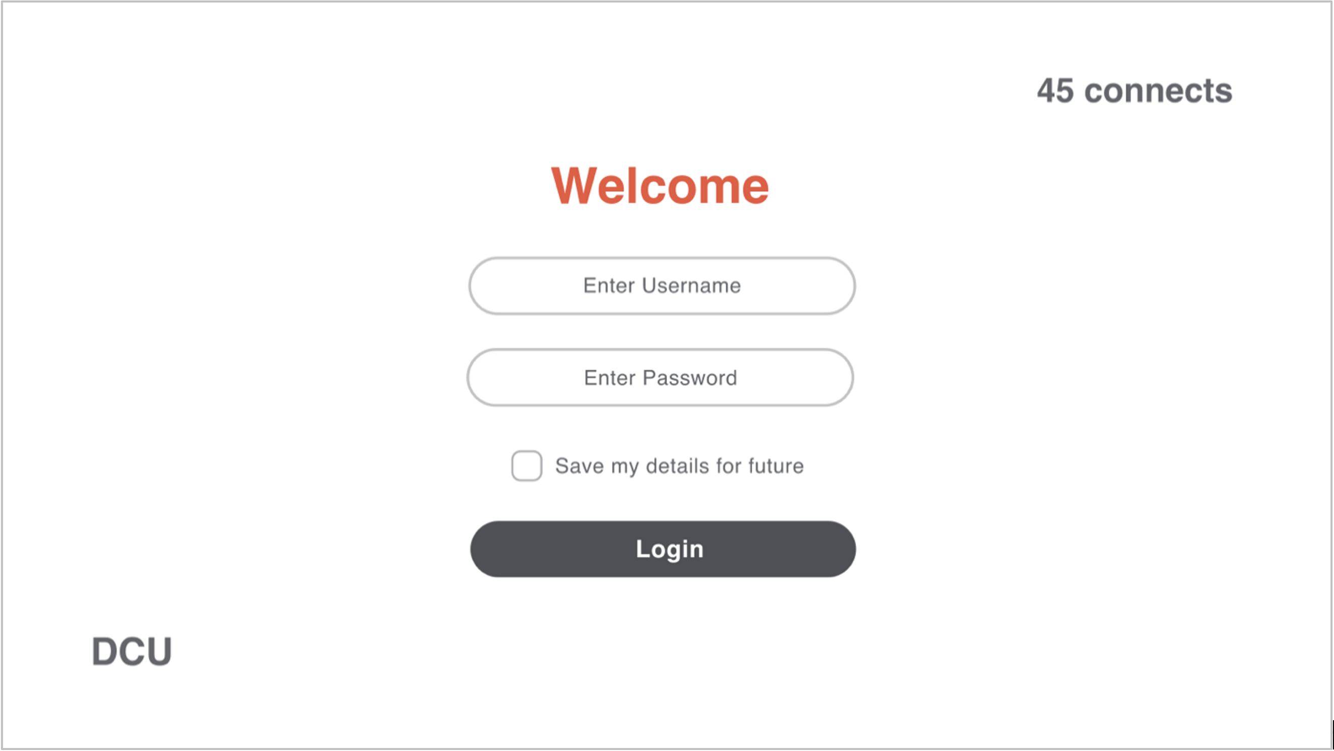
Figure 20: Login screen.

Figure 21: Homepage.

Figure 22: Game play interface with menu.

Figure 23: Social area.

Figure 24: Alternative card playing mobile interface.
Justification of Fidelity
Developing medium fidelity prototypes for the first round of testing with users was the preferred approach over using original low-fidelity wireframes.
There are countless benefits to testing low-fidelity prototypes early in the process with users to obtain feedback on a concept or journey and quickly iterate before significant investment has been made into resources and even into ideas.
Medium fidelity prototypes were developed in this instance for the following reason:
- Barriers to older adults adopting new
technology often comes down to issues of confidence. Mitzner et al. (2011)
study illustrates the main
difference between older adults and younger people using a new technology was
not due to their actual abilities - but was in fact limited by their own perception of these abilities, with older adults rating themselves as less capable.
Using a lower-fidelity prototype that requires users to forecast or predict how they would interact may lead to these limiting beliefs surfacing, impacting on the feedback in a negative light.
5. Usability Testing
Five participants recruited for this first
round of usability testing.
Overall goal of the usability sessions is to gather data pertaining to users’ perceptions of and behaviours with this new system.
The core evaluation method chosen is a remotely moderated user testing session using the think aloud protocol. This remote environment replicates how users will interact to play 45 remotely in their homes, so was deemed particularly apt.
The session itself takes a hybrid approach using both exploratory and assessment methods. (Goodman, Kuniavsky and Moed, 2019). The exploratory approach involves the user being asked general questions about the interface and the assessment approach involved the user performing some basic tasks on the prototype to gain further insight into their understanding of the system and catch any problems they may experience in terms of usability.
Data Analysis
The data from these video sessions was analysed first using deductive
thematic analysis using codes that applied to the areas of interest
(perceptions and behaviours) and then an affinity diagram was created. Figures 25 to 28 show details of this process.
- 3 female, 2 male
- Retirees living in Ireland
- Median age, 71 yrs old
Overall goal of the usability sessions is to gather data pertaining to users’ perceptions of and behaviours with this new system.
The core evaluation method chosen is a remotely moderated user testing session using the think aloud protocol. This remote environment replicates how users will interact to play 45 remotely in their homes, so was deemed particularly apt.
The session itself takes a hybrid approach using both exploratory and assessment methods. (Goodman, Kuniavsky and Moed, 2019). The exploratory approach involves the user being asked general questions about the interface and the assessment approach involved the user performing some basic tasks on the prototype to gain further insight into their understanding of the system and catch any problems they may experience in terms of usability.
Data Analysis
The data from these video sessions was analysed first using deductive
thematic analysis using codes that applied to the areas of interest
(perceptions and behaviours) and then an affinity diagram was created. Figures 25 to 28 show details of this process. 
Figure 25: List of deductive codes applied during thematic analysis.

Figure 26: Example of codes being applied to the data about login and homepage.

Figure 27: Data grouped into catagories that relate to perception of system.

Figure 28: Affinity diagram from usability testing.
Findings
Overall, the new system
was well received and understood. It contains the basic utility needed for
users to partake in an online 45 event. The most prevalent impression expressed by users was they found the system be helpful. This attribute was evident in the following features and areas;
- Countdown timer to game
- Clear buttons and labels: button size, inclusion of retract card button.
- Familiarity: mental model of zoom, image of people
chatting points to function of area.
-
Given a choice: help available when needed,
alternative phone interface.
The main areas of confusion for the user were evident in the areas of navigation and labelling.
Home Page
-
‘Break Room’ label is not a clear
identifier for a social area/chat room. However, the image of people chatting
does help in identifying this.
- ‘Home’ iconography is causing
confusion; was intended to be a house icon to represent the page, but is being
perceived as a button with an arrow to direct user to home page.
Break Room
- Some zoom controls seem superfluous
to the needs of the user and are in conflict with other buttons on page.
Game Room -
Not clear how to access additional
controls in this area. The ‘show menu’ label on button isn’t aiding to address
this.
Times where the user expressed enjoyment during the evaluation were noted from their verbalisations, tone, demeanour and body language while interacting with the system. The three main drivers for these reactions were:
- Visual design
-
Interactions: rollover effect, when card moved
- Alternative phone interface: enthusiastic about the idea
The mobile card playing mechanism provided much enjoyment and the idea was met with enthusiasm and excitement by users. But concerns were raised around the practicalities of multi-device usage. For example, an iPad does not afford synchronous usage with mobile phone as intended without a stand. One user also found using two devices at the same ‘a bit daunting for me’.
Recommendations
To progress to the next iterative round of testing, these issues were collated and rated in terms of severity. The four most imperative issues to solve are:
- No
indication of who is chatting in break room before entering.
-
No way to play with
people user knows.
-
Small timer needed beside
retract card button to indicate how long to change mind.
-
Break room label not
clear signifier of area.
Figures 29 to 33 give recommendations to remedy these crucial, serious and minor issues below.

Figure 29: Homepage with recommended changes made.
Figure 30: Additional page added before entering chat room.

Figure 31: Chat Room with recommended adjustments made.
Stock images in the last iteration were causing confusion as it wasn’t clear these were player videos, the recommendation is to remove and include placeholders.

Figure 32: Recommended adjustments made to Game Room interface.

Figure 33: Additional Game Room page and new flow for Game Room pages.
Reflection
This case study took place over 7 months of course year 1 . Aside from visual design and ideation, all other methods and techniques were new to me. I learning a great deal about the role of an interaction designer through the project lifecycle of a new product and how varied a role that is.
We worked through this case study as individuals, but team forum discussions also aided our learning by discussing the merits and disadvantage of various approaches throughout the process.
A big takeaway for me was that so much of the process is about balance. As an interaction designer you’re primarily advocating on behalf of the users’ needs but these should be balanced with the business and stakeholder requirements. As a visual designer you strive to produce aesthetically pleasing and creative work but also need to consider accessibility and technical feasibility.
I feel my natural style is to evaluate all sides of a problem before jumping to conclusions, which should be a great asset as an interaction designer. But this also needs to be balanced with taking decisive steps forward.
The area of the process I found the most challenging was the research stage. This may have been because it was the first stage of the process and I was adjusting to a return to study, but I also had the least experience with these processes. Year 2 includes a dedicated research module where I look forward to further expanding my knowledge on this topic.
Bibliography
Holtzblatt, K. and Beyer, H., n.d. Contextual design.
Cooper, A., Reimann, R., Cronin, D. and Noessel, C., 2014. About face. Indianapolis: Wiley.
Goodman, E., Kuniavsky, M. and Moed, A., 2019. Observing The User Experience. Amsterdam: Elsevier.
Mitzner, T., 2011. Older Adults Talk Technology: Technology Usage and Attitudes. Comput Human Behav.,.
Nielsen Norman Group. 2021. Heuristic Evaluation: How-To: Article by Jakob Nielsen. [online] Available at: <https://www.nngroup.com/articles/how-to-conduct-a-heuristic-evaluation/> [Accessed 19 April 2021].
Sharp, H., Preece, J. and Rogers, Y., 2019. Interaction Design. Chichester: Wiley.