Personalising weather
Creating a personalised experience for the Met Eireann weather app based on user needs and schedules
︎ 4 Months | UX Tree Mentorship Programme Round 3
︎ Activities
Competitor Analysis, User Research, Data Synthesis, Affinity Diagramming, Personas, POV Statements, Low Fidelity Wireframes, Medium Fidelity Prototyping, Visual Design, User Testing
︎ Activities
Competitor Analysis, User Research, Data Synthesis, Affinity Diagramming, Personas, POV Statements, Low Fidelity Wireframes, Medium Fidelity Prototyping, Visual Design, User Testing


The problem
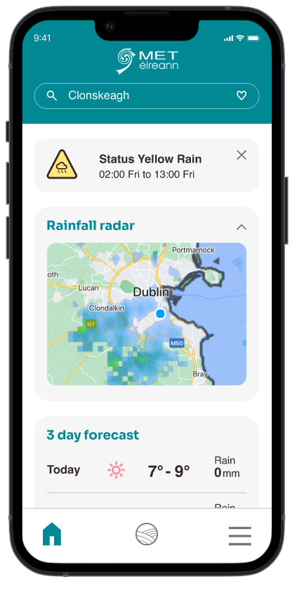
An initial UX review of the Met Eireann app uncovered issues with navigation, interaction and accessibility concerns.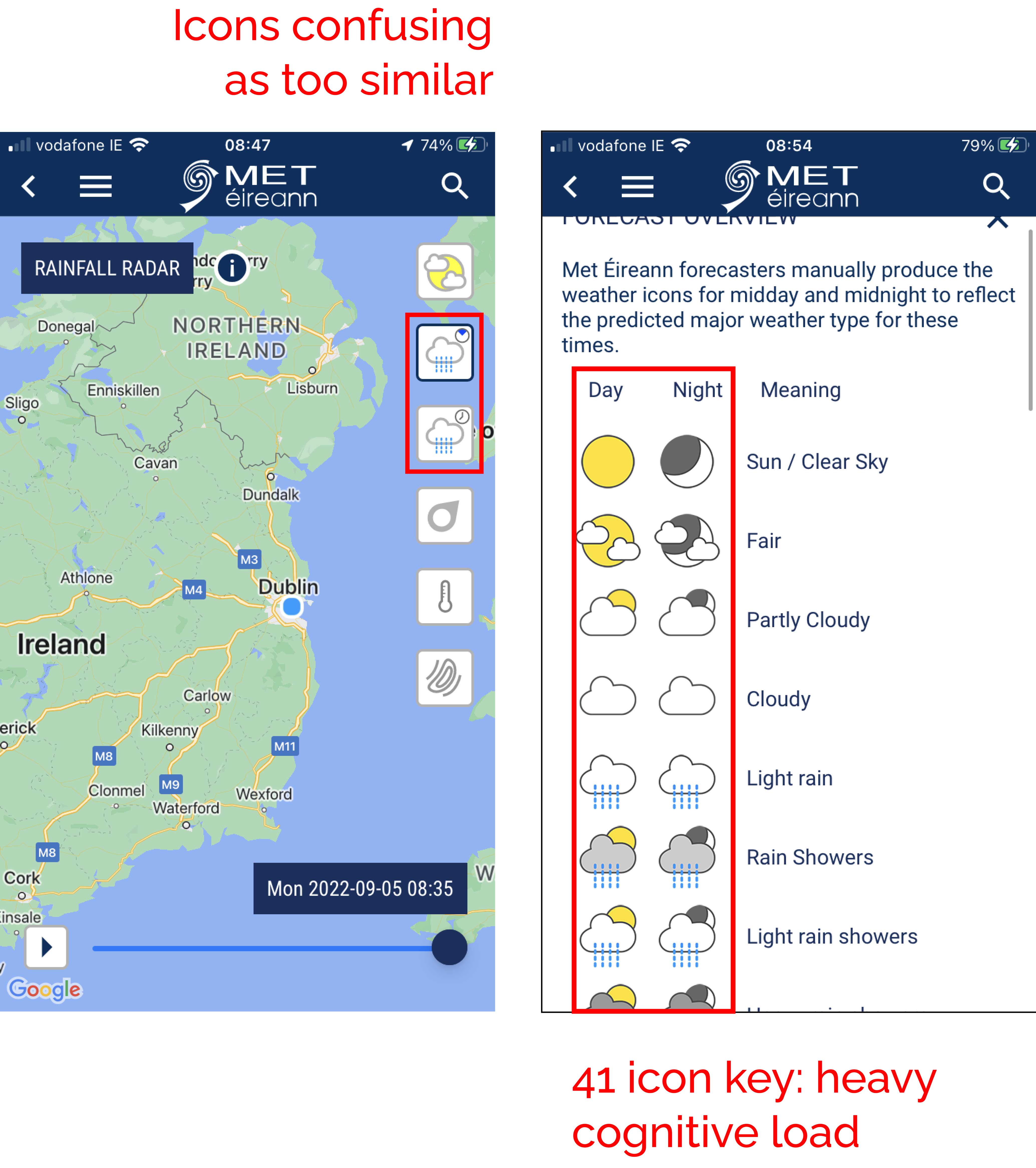
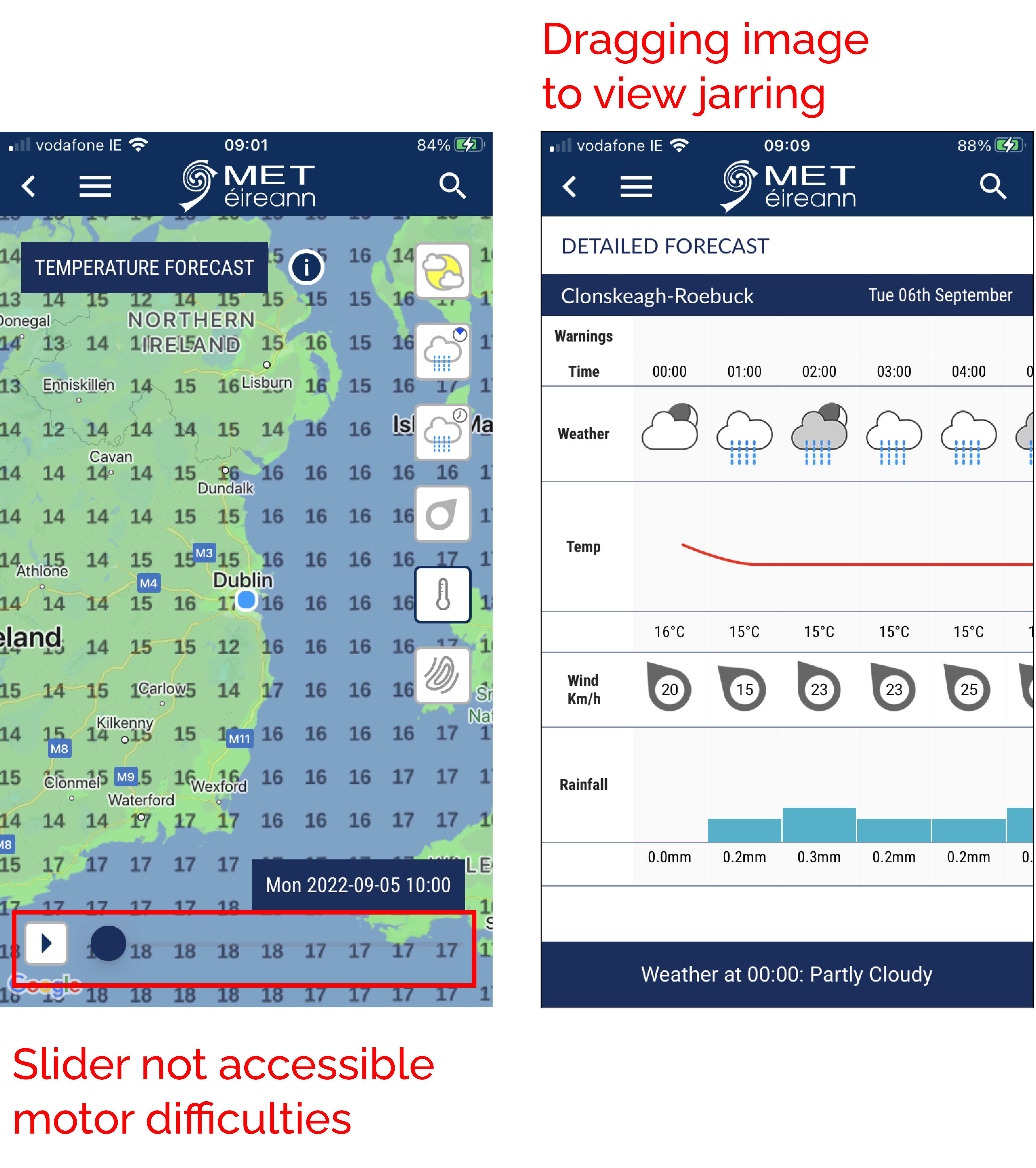
Image 1: UX review issues
The user experience of the app needs to better represent organisation that is the leading provider of weather information and related services in the State.
Users need to be able to easily navigate through content and find the information they need.
︎ Project stages and activities
The user experience of the app needs to better represent organisation that is the leading provider of weather information and related services in the State.
Users need to be able to easily navigate through content and find the information they need.
︎ Project stages and activities

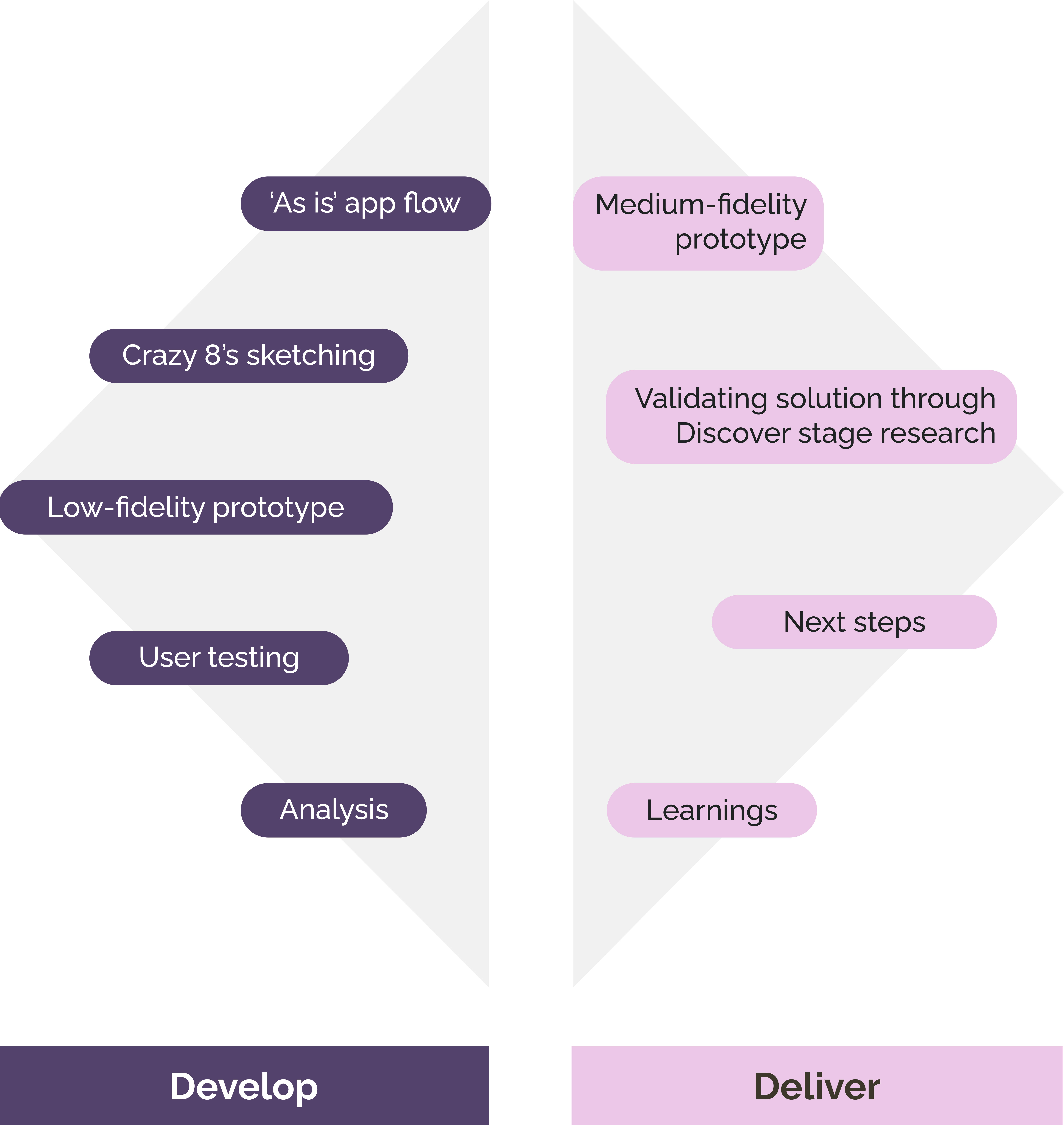
Image 2: Design Council Double Diamond Framework
Discover
︎ Secondary research
Desk Research
Began by reading articles and academic papers related to topic of weather. This prompted the following questions relating specifically to health.
- Do people reflect on environmental factors to make better health decisions?
- Have people considered a weather app as a health application?
- Do people consider climate change as something that will influence their own health?
App store reviews
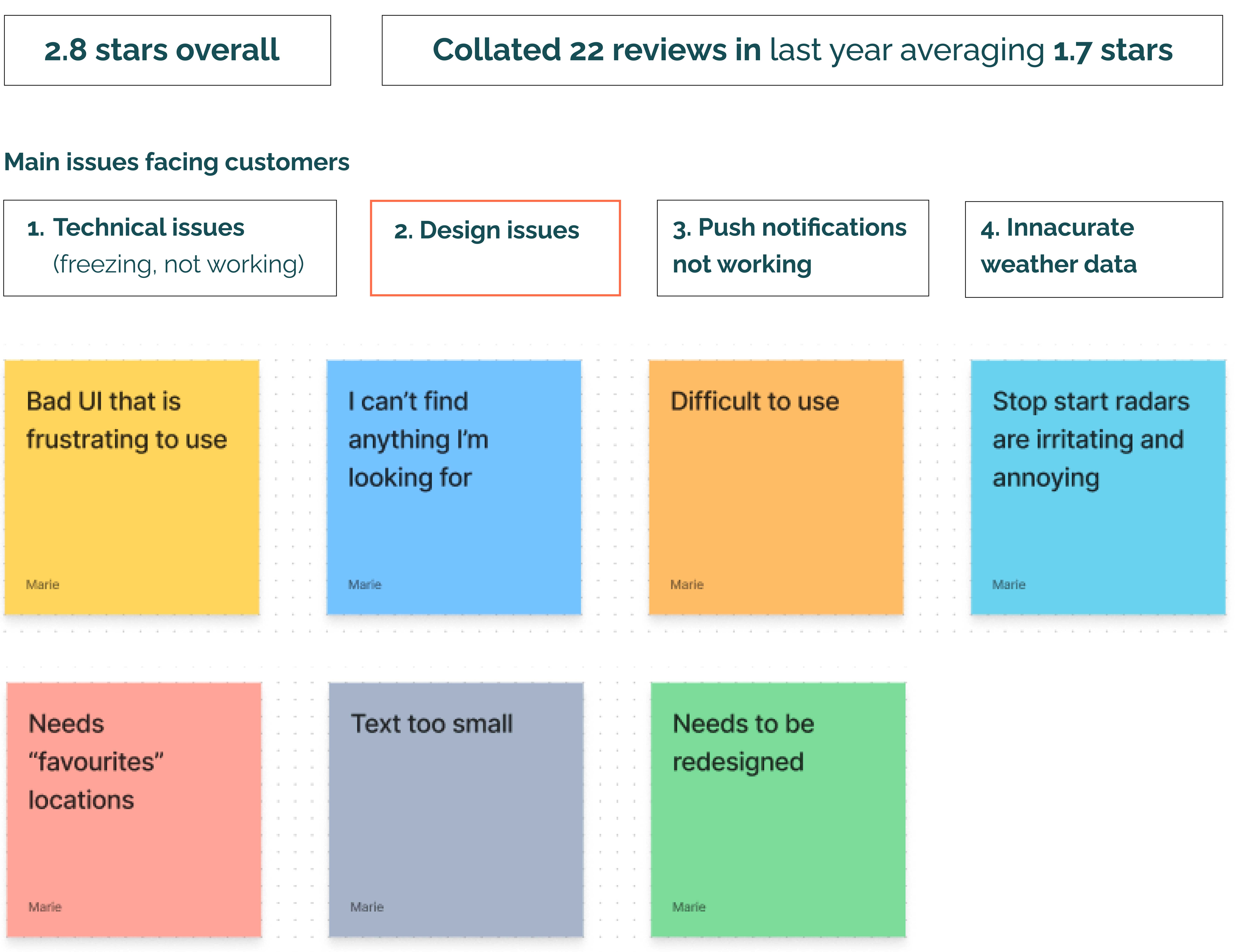
Image 3: Summary of app store reviews
Competitor analysis
A competitor analysis was carried out on 3 direct competitors of Met Eireann. The iOS Weather app, Yr and AccuWeather and 1 tangential competitor WeatherWell.
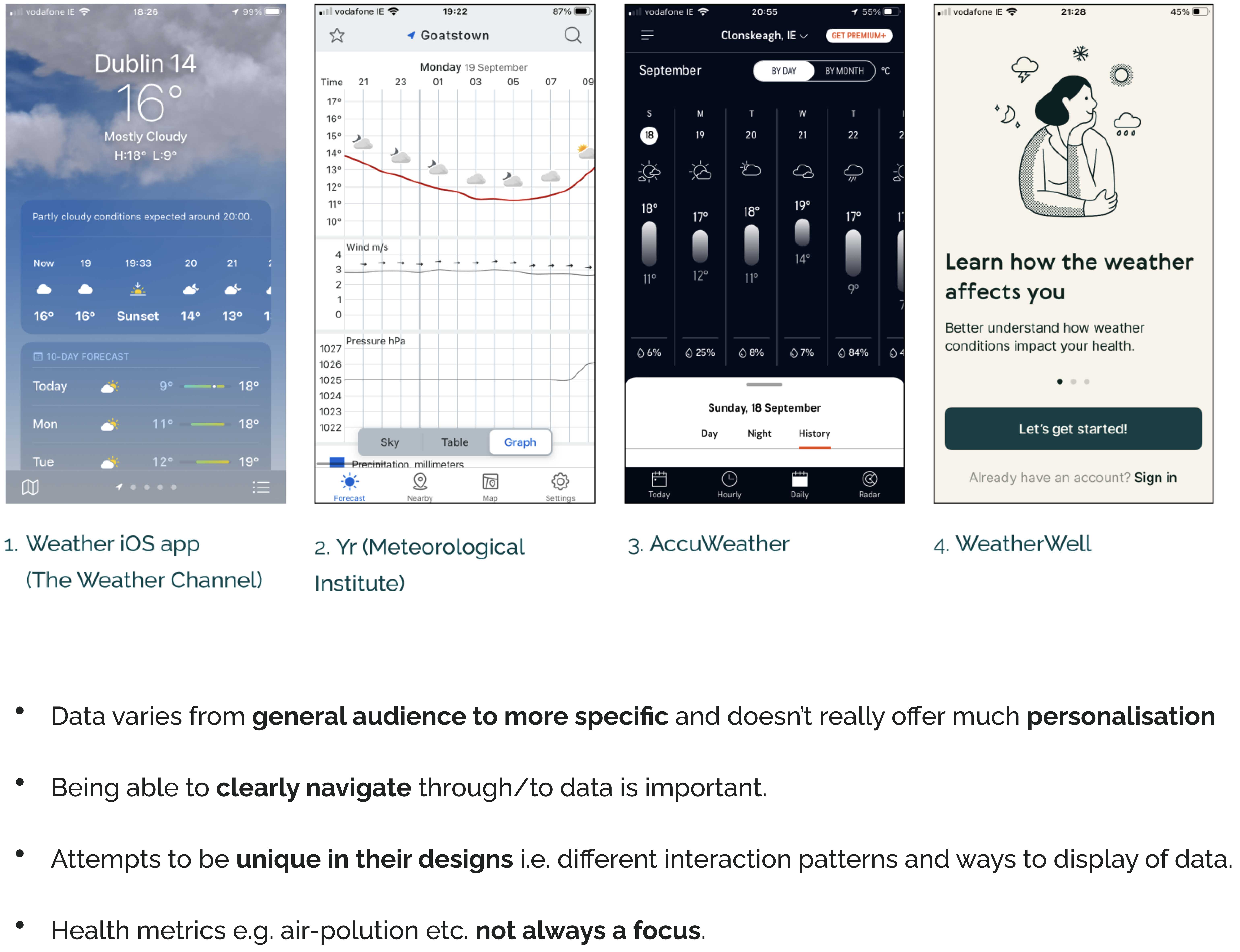
Image 4: Competitor analysis summary
View full competitor analysis.
︎ Primary research
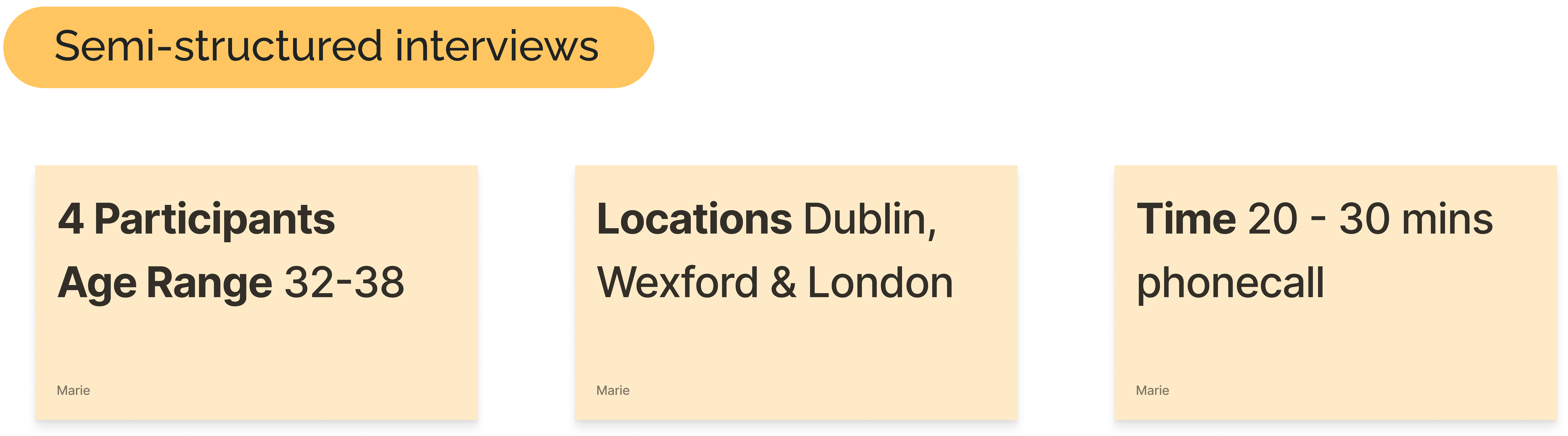
Semi-stuctured interviews
Erica Hall describes generative or exploratory research as ‘What is a good problem to solve stage’ - Erica Hall Just enough research. Interviews were chosen as a suitable first method to understand broadly what people they do and what it is they need.
Problem statement/research question
Describe the experience of people who search for the weather forecast
Areas of knowledge required
Behaviours around searching for weather forecast, motivations and impact on wider life. View interview guide.
Interview data analysis
Carried out affinity diagramming on key codes from interview transcripts.
In analysis looked for indications of: goals, priorities, tasks, motivators, barriers, habits, relationships, tools, environment.

Image 5: Higher level tertiary and secondary themes
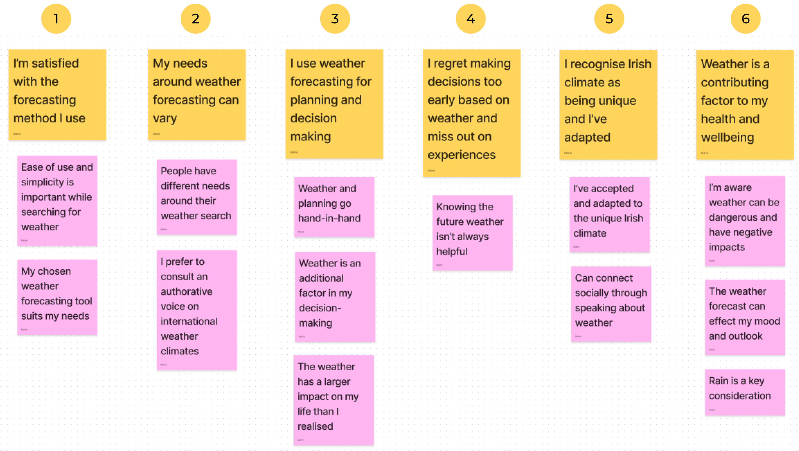
Image 6: 6 primary themes emerging with secondary themes
View affinity diagram for full data analysis.
Survey
Once interview themes emerged, a survey was devised to confirm these themes with a larger quantitative sample. Online survey produced 27 respondents to 13 questions. View survey questions.
Confirming interview themes with survey data

Define
PersonasPersonas were created based on the research findings from the Discover stage. The first focused primarily on the theme of using weather forecasting for planning and decision making and the second had more of a focus on weather being a contributing factor to health and wellbeing.

Image 7: Persona 1

Image 8: Persona 2
Point of view (POV) statements and how might we (HWM) statements
A POV statement highlights the design challenge and creates an actionable problem statement on which to focus ideation.
A POV statement highlights the design challenge and creates an actionable problem statement on which to focus ideation.
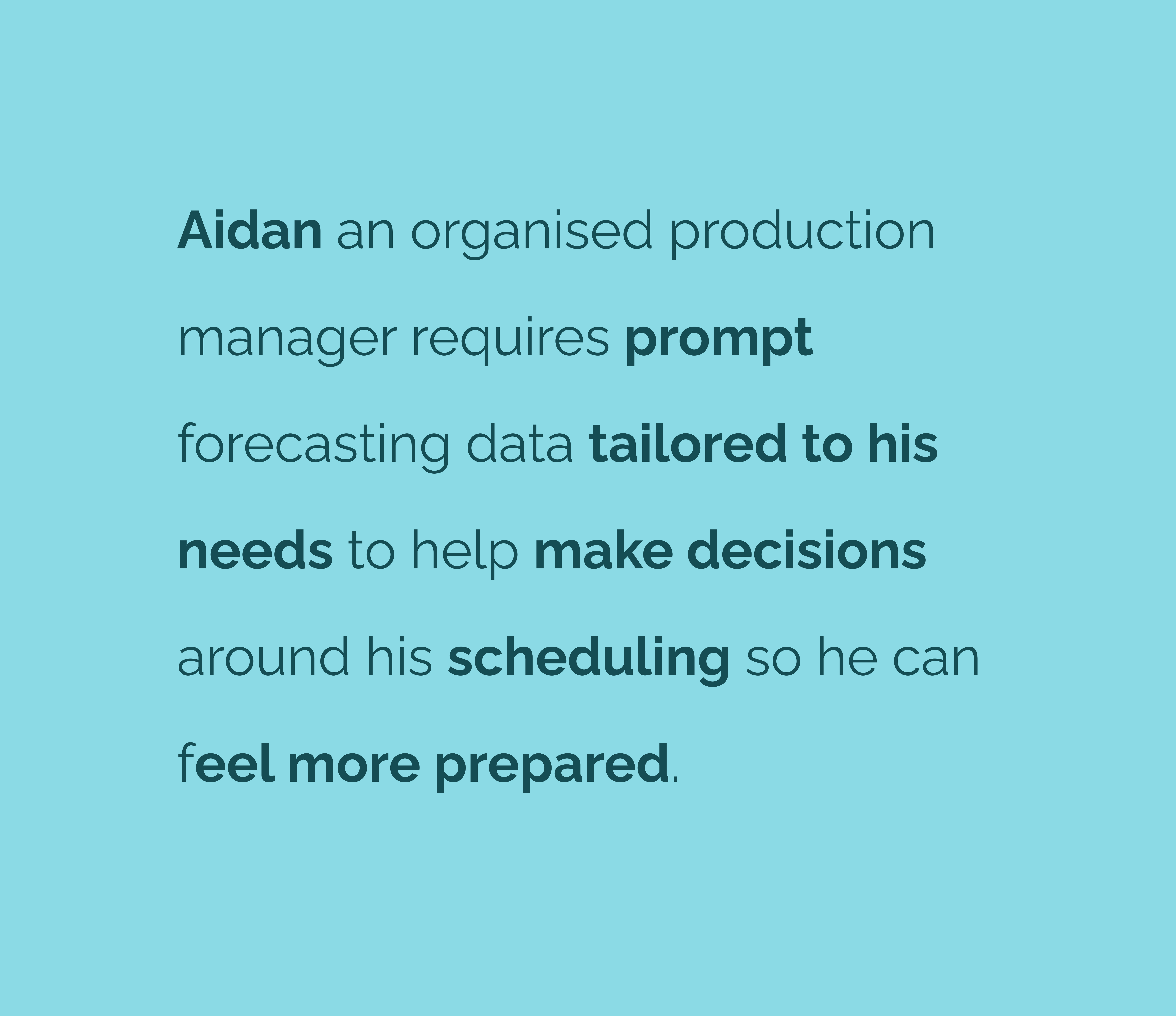

Image 9: POV and HMW statements for persona 1
Prioritisation matrix from pain-points
All pain points from activities carried out at Discover phase were affinity mapped and prioritised to help determine key areas of focus. The matrix considered the impact to both user and business.
All pain points from activities carried out at Discover phase were affinity mapped and prioritised to help determine key areas of focus. The matrix considered the impact to both user and business.
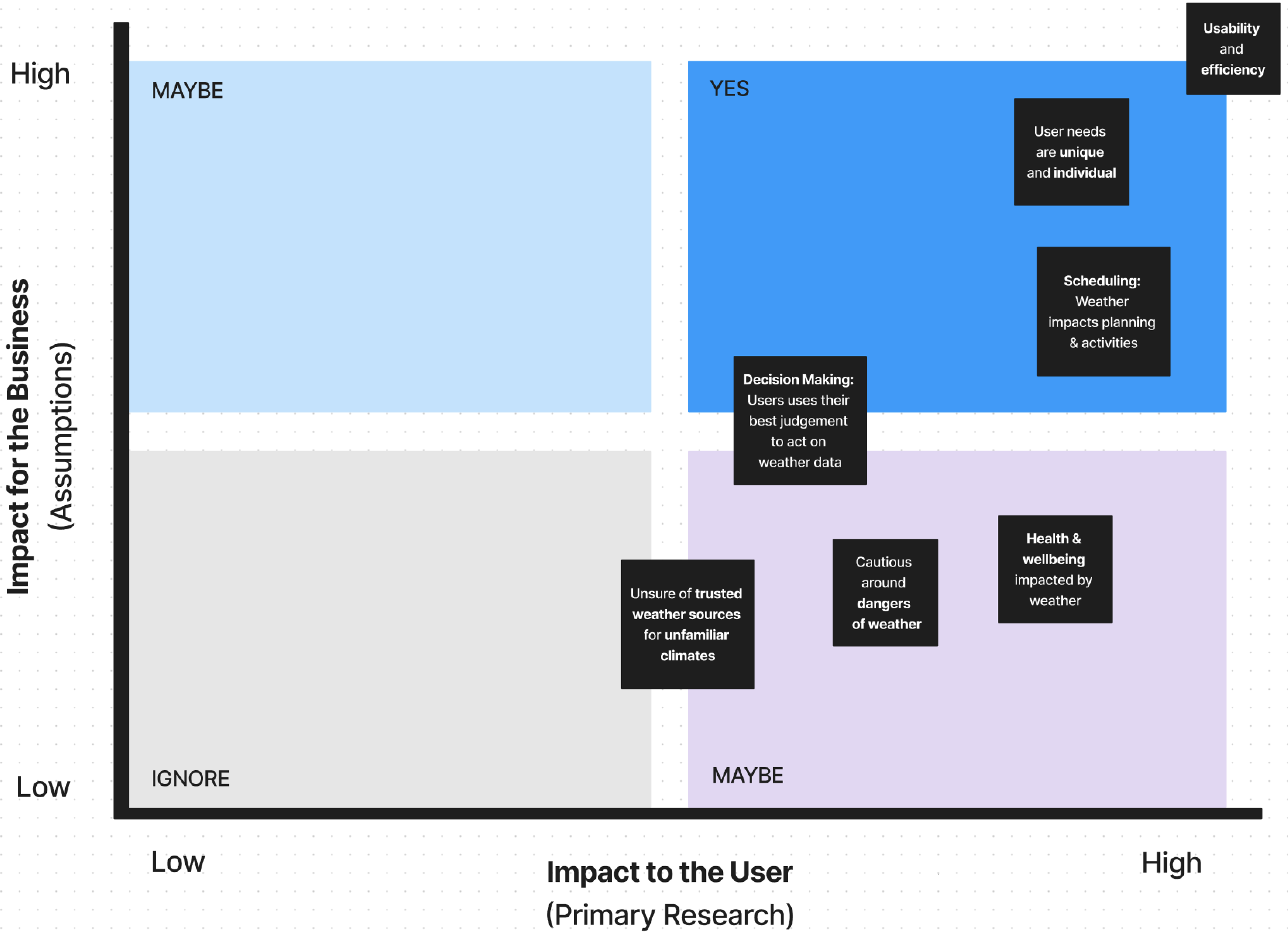
Image 10: Prioritisation matrix
The key pain points uncovered from this exercise related mostly to persona 1.
To reduce project scope the needs of persona 1, around planning and scheduling were only considered for this release.
Develop
‘As is’ screen flowA screen flow of the existing architecture and menu structure of the Met Eireann app was created, highlighting crowded homescreen and busy navigation menu.
During ideation and design the architecture of the site naturally re-organised around new potential solutions.

Image 11: ‘As is’ app screen flow
Crazy 8’s sketching
Used the crazy 8 method to quickly sketch roughly 8 solutions. Each set of 8 concepts was based on the x 4 HMW statements.

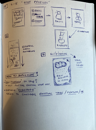
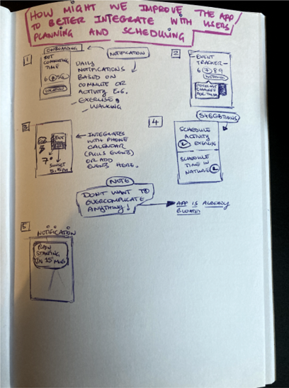
These sketches were then recreated digitally in FigJam to produce very basic first wireframes.
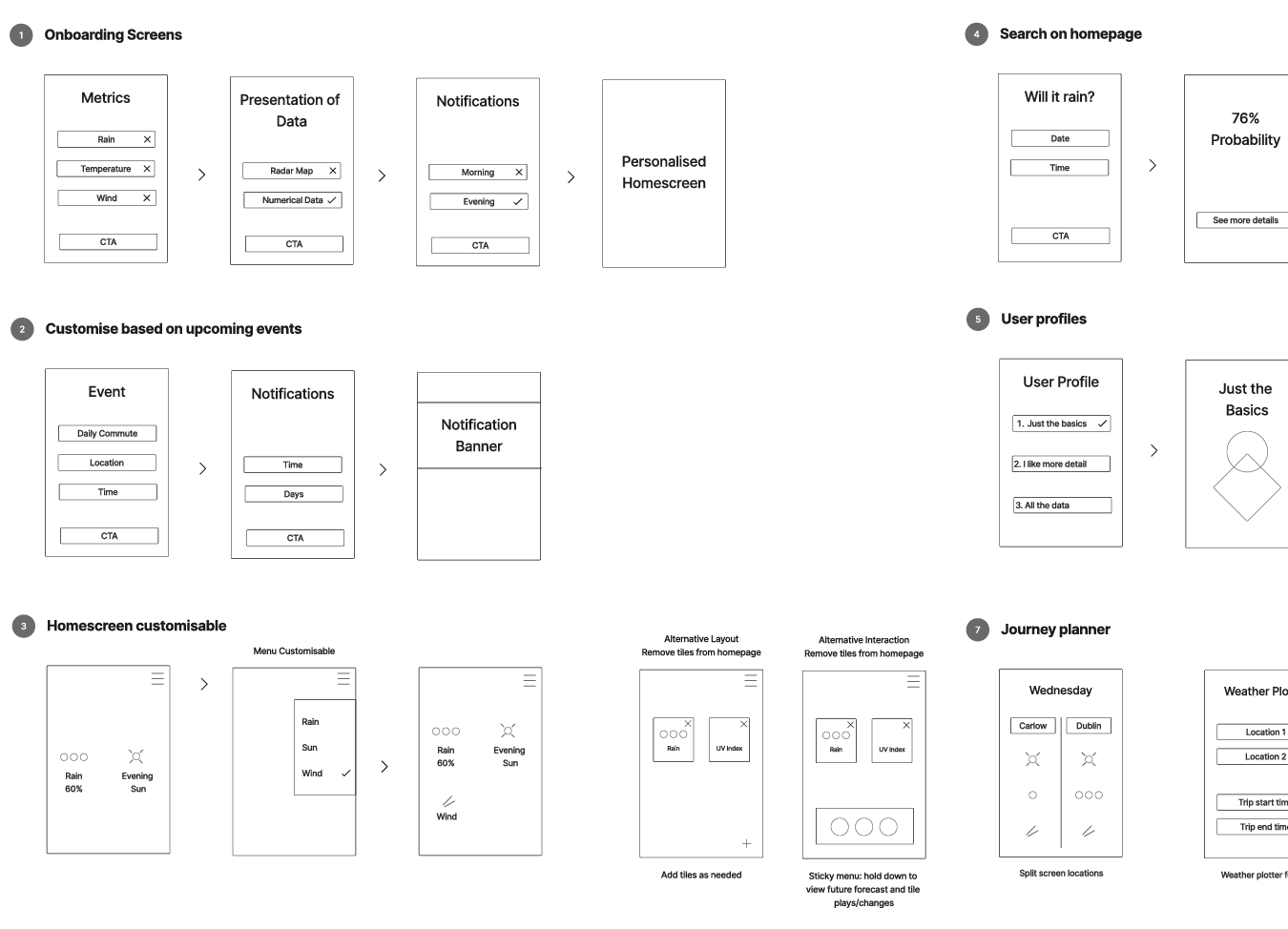
Image 12: Basic wireframes from sketches
Low-fidelity prototype
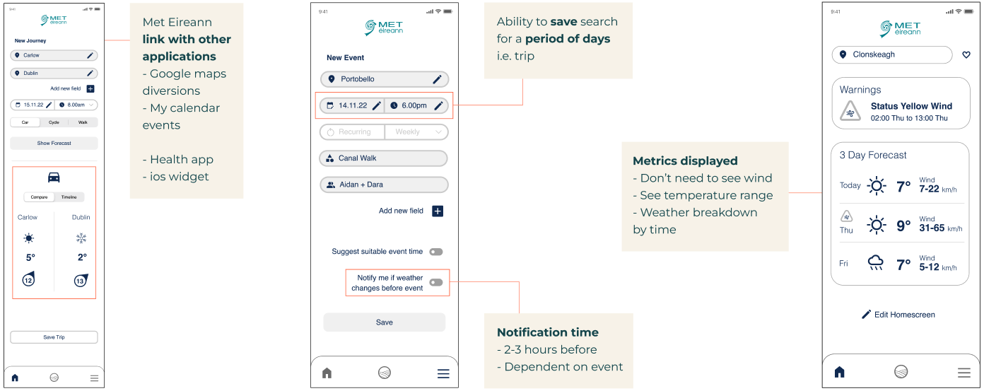
Two new pieces of functionality emerged allowing user to personalise weather forecasting data around their own needs and schedules.
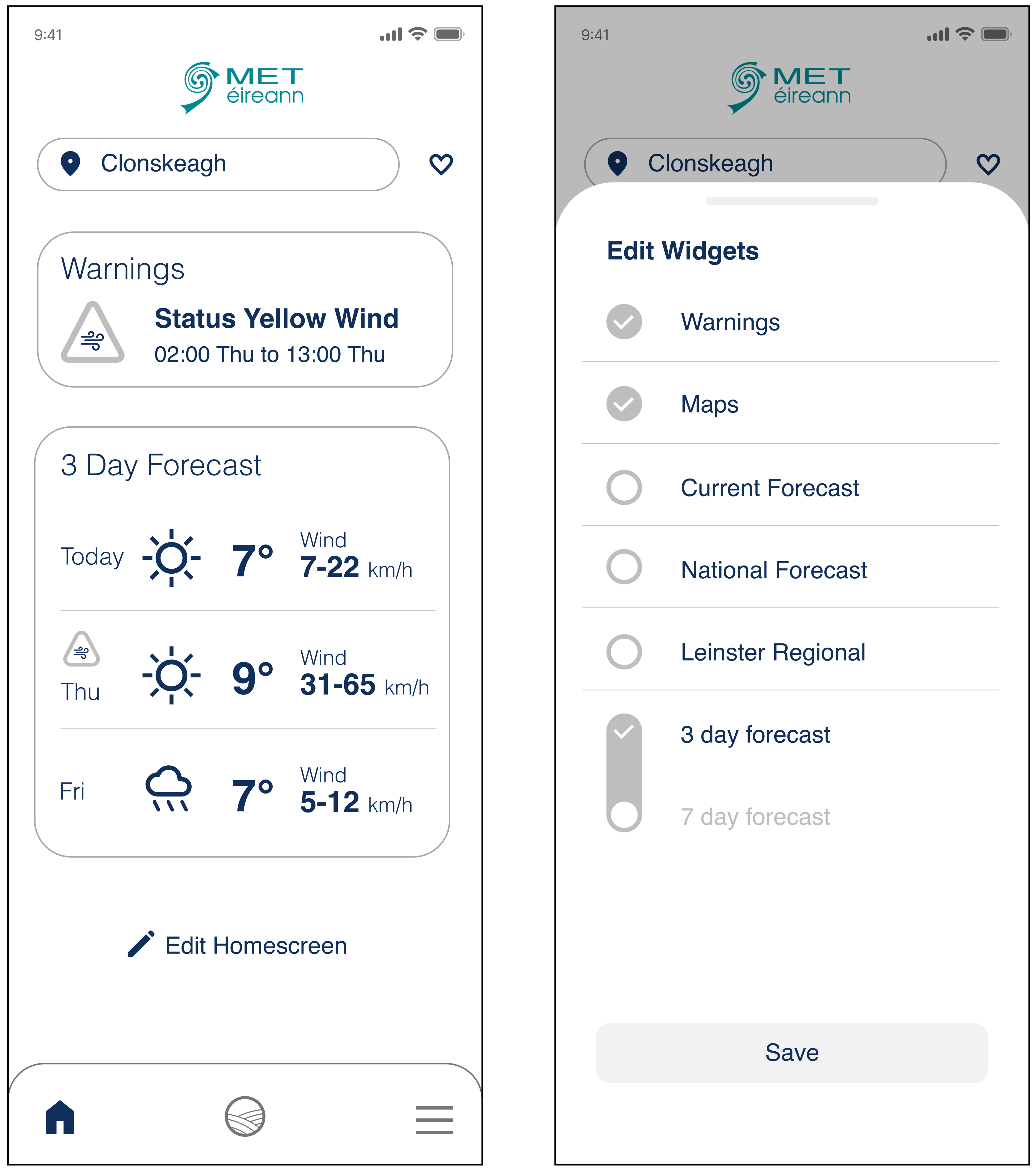
1. Edit widgets & metrics
Widgets: User selects the their preferred weather information to be displayed on homescreen.
Metrics: User selects most relevance weather metrics e.g. rain, wind. Not included in current iteration.
Widgets: User selects the their preferred weather information to be displayed on homescreen.
Metrics: User selects most relevance weather metrics e.g. rain, wind. Not included in current iteration.
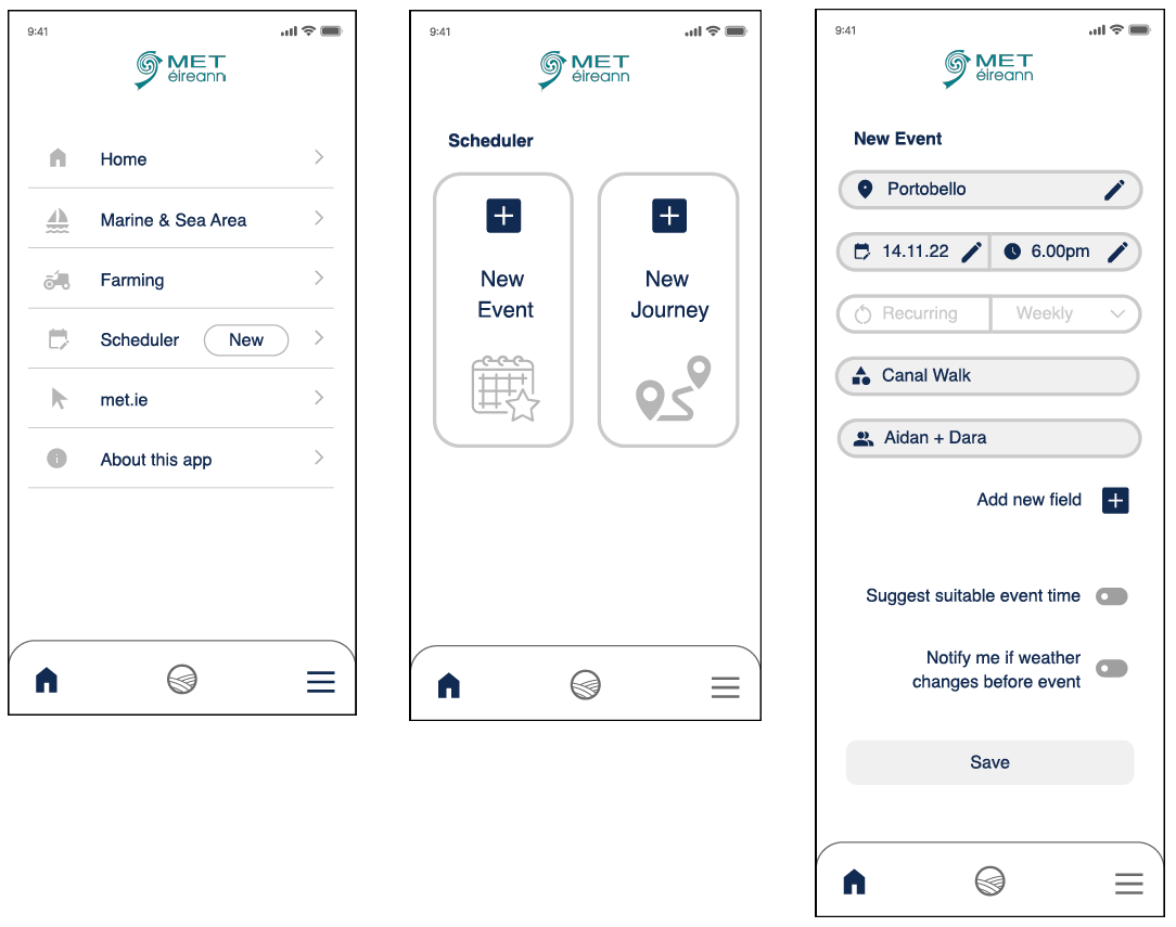
2. Scheduler
New Event: Save one-off or recurring event to homescreen to see weather at a glace, recieve notifications if weather changes and share with others.
New Journey: Displays expected weather between locations when traveling by car, cycling or walking.
New Event: Save one-off or recurring event to homescreen to see weather at a glace, recieve notifications if weather changes and share with others.
New Journey: Displays expected weather between locations when traveling by car, cycling or walking.
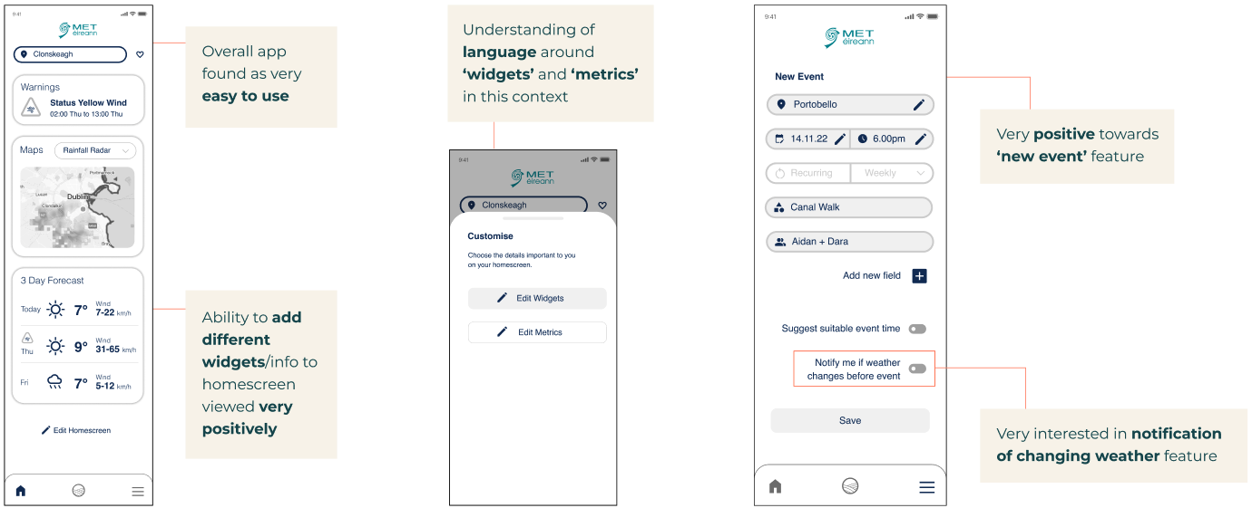
User testing & analysis
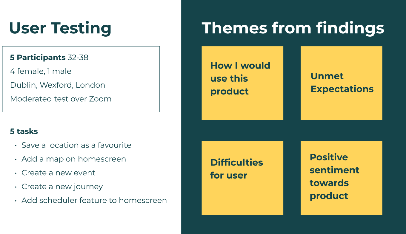
As feedback on new concepts was sought, user testing was carried out on low-fidelity prototype to encourage feedback, compared with a more finished product. View user testing affinity diagramming and results.
Findings
Theme 1: How I would use this product

Theme 2: Unmet expectations
Theme 3: Difficulties for user
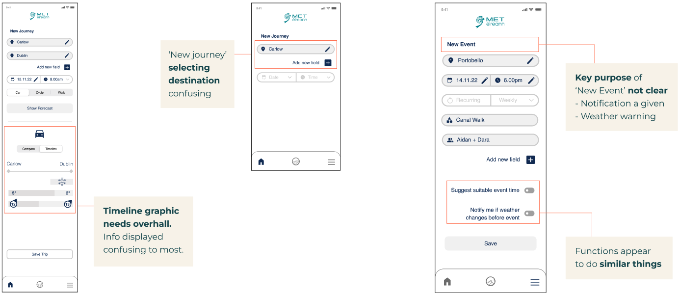
Theme 4: Positive sentiments
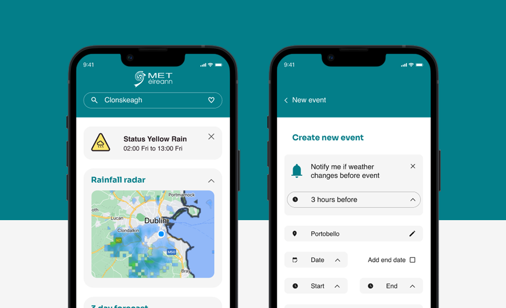
Deliver
Based on user test feedback the following key changes were implemented to create medium-fidelity prototype:
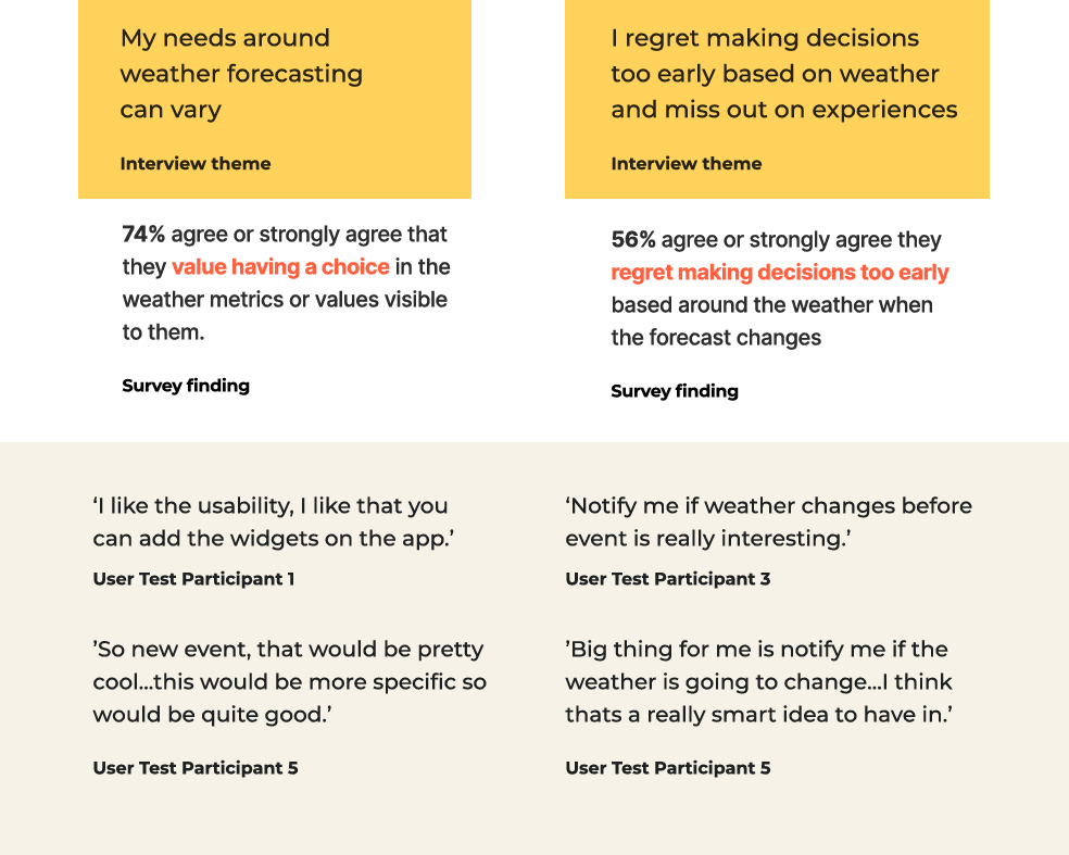
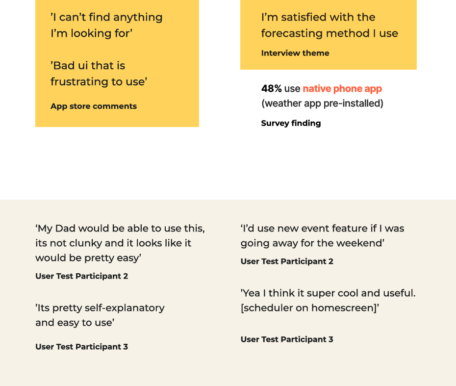
Validating solution through Discover stage research compared with user testing insights
Next Steps
- Further usability testing on medium fidelity prototype
- Further develop the design and look of the product
- Develop the ‘metrics’ section of the app and how user would change metrics on homescreen
Learnings
- Define the scope early in the design phase - wasted time going back and forth between define and design stages
- Leave enough time to work on the design
- In general I learned a lot on this project around mobile UI design and components